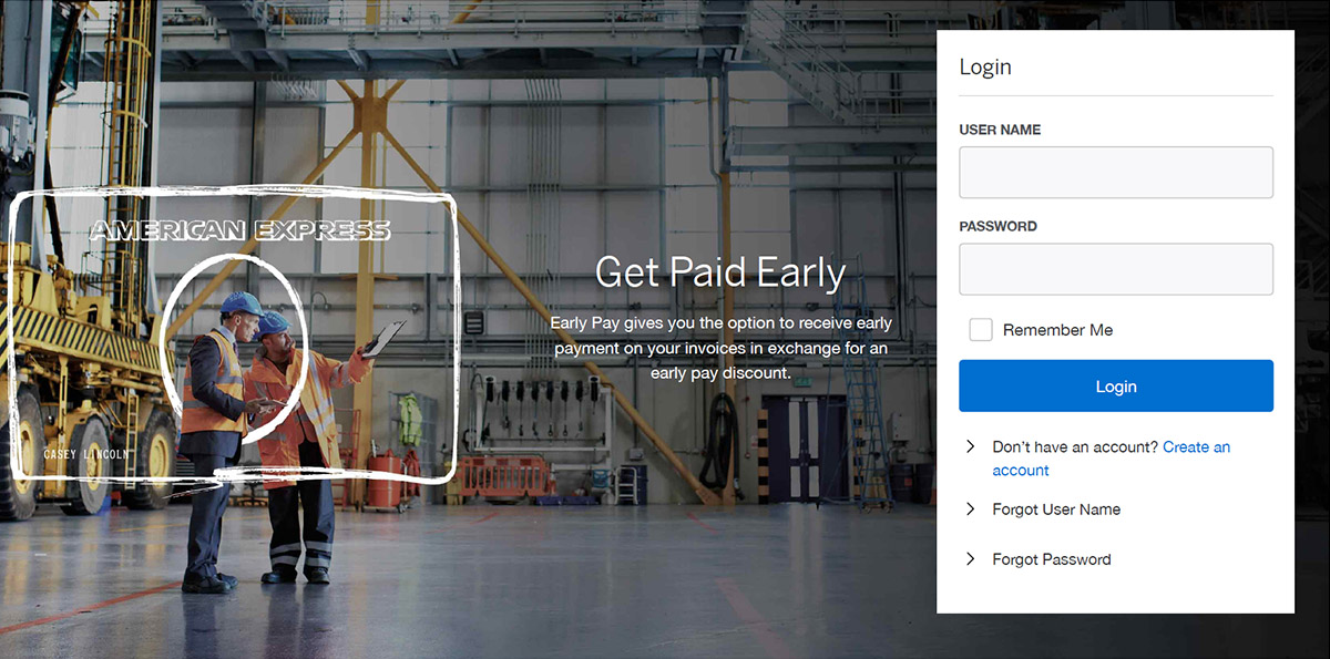
American Express EarlyPay

American Express EarlyPay was part of a broader effort to streamline B2B financial processes, allowing businesses to improve cash flow by offering early payments on invoices. The initiative aimed to create a seamless user experience for both suppliers and buyers, focusing on efficiency and clarity in managing early payment options. As the UX Director and Lead Designer, my role was to strategically guide the design process, integrating business needs and user requirements into a cohesive, intuitive interface that ultimately became a key B2B feature for Amex.

“We used EarlyPay to get paid faster. We used that cash to buy inventory and expand distribution. Which increased our profits. I would recommend EarlyPay to anyone looking to grow their business.” —Mark Armendariz, CEO of Spanish Food Solutions

Introduction

American Express undertook a complex initiative to expand their B2B services through the development of EarlyPay, a platform designed to streamline cash flow management by offering early payment options for invoices. This project required a nuanced understanding of both accounts payable processes and the intricate financial relationships between buyers and suppliers. As the UX Director and Lead Designer, I was tasked with translating these complexities into a user-friendly experience that balanced business objectives with real user needs. This case study delves into the strategic decisions, collaborative efforts, and design solutions that led to the successful launch of EarlyPay as part of American Express’s B2B portfolio.

Vision Day Workshop

Our kickoff with the amex team

To kick off the EarlyPay project, we held a Vision Day workshop with key stakeholders from American Express, representing both the product and B2B services sides. Our goal was to align on a shared understanding of the platform’s direction. Before the workshop my team and I conducted detailed desk research to identify tensions in critical elements like the Customer’s Reality, Competition, Communications, and the interaction with the Company/Brand. This allowed us to steer the conversation in a productive direction from the outset.

The insights gathered during this session provided a clear, actionable framework for the design and development phases, ensuring that our approach addressed both business goals and user needs.

From Strategy to Execution

With the actionable framework established from the Vision Day workshop, we moved into the design phase. Leveraging the insights gained, I led my team in translating these findings into tangible design outputs. We collaborated in Figma, utilizing American Express’s Design Language System (DLS) to maintain brand consistency while ensuring the user interface was intuitive and aligned with business objectives.

Key to this phase was the development of the buyer interface, which allowed users to manage early payment decisions on invoices. Alongside this, we created two prototypes—one for offer acceptance triggered by an email notification and another for single invoice management within the dashboard. The designs focused on simplicity and efficiency, allowing users to make informed decisions with ease.

Throughout this phase, I coordinated closely with the development team in India to ensure that design features were feasible within the production timeline, balancing user experience with technical constraints. This iterative process of designing, validating, and refining helped solidify the core user flows and prepare us for the upcoming testing phase.

Validating the Design with User Testing

With the prototypes ready, we moved into the user testing phase to validate the design choices and ensure they met both user needs and business objectives. We tested two key flows: offer acceptance via email and single invoice management in the dashboard in UserTesting.com. The testing involved a diverse group of participants, ranging from accounting professionals to decision-makers in finance, to reflect the varied user base EarlyPay was targeting.

The results were largely positive. Users consistently found the interface intuitive, with high task success rates across both prototypes. The feedback reinforced that the buyer interface was clear and effective in helping users make informed decisions without confusion.

The user testing also uncovered opportunities for refinement. Some participants expressed confusion around the “Auto Early Pay” feature and desired clearer confirmation windows. We documented these findings and made iterative adjustments to address usability concerns. These refinements were instrumental in ensuring that the final product was not only functional but user-friendly, aligning with the strategic goals set out from the start.

Testing Results

These are the key results from our user testing, highlighting the strong task success rates and positive feedback that validated our design approach. Users performed well across the main use cases. 86% of users successfully completed the task of accepting an offer from the Early Pay email, 90% successfully chose a payment date and accepted an eligible invoice, and 87% were able to change the payment date of a scheduled invoice​

Users gave the overall ease of use for the system very high ratings. The ease of choosing a payment date and accepting an eligible invoice was rated 5/5, while other tasks such as accepting an offer from an email scored 4.8/5.

Many users found the system intuitive and easy to navigate, with one participant stating, "It's so simple in fact that I think anyone could use it." Another noted, "Extremely useful and user-friendly site," underscoring the positive experience testers had with the system​

Reskinning the Early Beta with CSS to Accelerate Implementation

As the project progressed, we faced the challenge of aligning an existing early beta version of the tool with the Design Language System (DLS) provided by American Express. Instead of going through a time-consuming redesign of the entire interface, I saw an opportunity to streamline the process. By writing custom CSS, I was able to reskin the existing beta version to match the new design standards set by the DLS.

This approach allowed us to bypass a full redesign phase, significantly reducing the time required to bring the product to market. The visual consistency between the prototypes and the reskinned beta ensured a cohesive user experience while maintaining the functionality of the existing tool. As a result, the project was accepted by American Express product owners and greenlit to become a B2B feature in the Amex portfolio.

Conclusion

The EarlyPay project exemplified how thoughtful design, strategic decision-making, and efficient execution can drive the success of a complex B2B solution. From leading the Vision Day workshop to aligning stakeholders and setting a clear framework, to writing CSS to accelerate implementation, every phase of the project was focused on delivering a user-friendly platform that met both business goals and user needs.

Through careful validation in user testing, we ensured that the interface was intuitive, and the high task success rates reinforced the value of our design decisions. Ultimately, the project was greenlit as a B2B feature of American Express’s portfolio, showcasing the effectiveness of the collaboration and the long-term impact of our work.

This project reflects my ability to navigate complex financial systems, translate business objectives into user-centered design, and implement solutions efficiently, all while maintaining a focus on driving tangible outcomes for the client.

Carl Sagan, Pale Blue Dot: A Vision of the Human Future in Space

"The significance of our lives and our fragile planet is then determined only by our own wisdom and courage. We are the custodians of life's meaning. We long for a Parent to care for us, to forgive us our errors, to save us from our childish mistakes. But knowledge is preferable to ignorance. Better by far to embrace the hard truth than a reassuring fable. If we crave some cosmic purpose, then let us find ourselves a worthy goal."